Accentis Enterprise grid options
The Accentis Enterprise grid options page allows you to customise how information is displayed on Accentis Enterprise Searches.
 Features
- Allows you to set search-specific options (through Set display options for this grid...) or global options (through Set display option defaults for all grids...).
- Options set for a specific search override options set for all searches.
- Allows you to mark each checkbox as either
 ticked (option is on),
  unticked (option is off), or
  shaded (unspecified).
- If an option is set as shaded (unspecified) for a specific search, the global option is used.
- If an option is set as shaded (unspecified) for a specific search and for all searches, the default value is used.
- If an option is set as
Accentis Enterprise grid options form
Module: System
Category: Searches
Activation: Right-click results of any Search > Set display options for this grid... / Set display option defaults for all grids...
Form style: Single instance modal
Special actions available for users with Administrator permissions:
- None
Database rules:
- Global grid options (display option defaults for all grids) are saved against your Windows profile (the account currently logged into the computer).
- They will apply to all Accentis Enterprise users that are logged into the same Windows profile on the same computer.
Permissions Rules:
- No permissions are required to open the Accentis Enterprise grid options form.
- Because you need to launch the form from a search, you still need the necessary permissions to access the search.
Field definitions
General settings tab
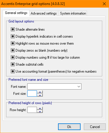
Shade alternate lines
If this option is on, alternating rows are displayed with different background colours to make it easier to read across the grid.
If this option is off, all rows are displayed using the same background colour.
Display hyperlink indicators in cell corners
If this option is on, cells containing hyperlinks appear as normal text with a triangle indicator in the top-left corner of the cell.
If this option is off, cells containing hyperlinks appear as blue, underlined text with no indicator.
Highlight rows as mouse moves over them
If this option is on, the row under the mouse pointer is highlighted as the cursor moves through the grid.
If this option is off, rows are not highlighted when the mouse moves over them.
Display zeros as blank (numbers only)
If this option is on, numeric values of zero are displayed as blank cells.
If this option is off, zero values are displayed as 0.
Display numbers using # if too large for column
If this option is on, values that are wider than their cell are displayed as a series of # characters.
If this option is off, values will not be altered, but they may appear cut off if they are wider than the column width.
Shade subtotal cells
If this option is on, subtotal cells are displayed with a different background colour to distinguish them from regular data.
If this option is off, subtotal cells use the same background colour as regular data.
This option has no impact if subtotals are toggled off for the search.
Use accounting format (parentheses) for negative numbers
If this option is on, negative currency values are displayed using parentheses, for example (100.00). This only affects currency values; quantities or other numerical values may still show with a minus sign.
If this option is off, negative currency values are displayed with a minus sign, for example -100.00.
Font name
If a font name is selected, the grid data is displayed using the specified font.
If no font name is selected, the default font is used.
Font size
The text in each cell is displayed at this font size. This can be used to make text more readable but may make it taller or wider than its cell.
If no font size is specified, the default font size is used.
Row height
Each row in the search grid is displayed at this height in pixels. This can be used to make text more readable, especially if the Font size has been increased.
If no row height is specified, the default row height is used.
Advanced settings tab
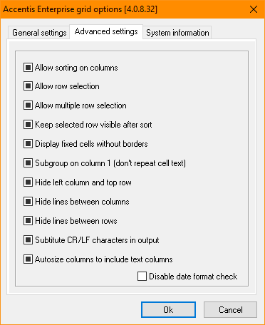
Allow sorting on columns
If this option is on, users can click a column header to sort the grid by that column.
If this option is off, column headers cannot be clicked, and the grid order cannot be changed by sorting.
Allow row selection
If this option is on, users can select rows by clicking them or using the Select All button.
If this option is off, rows cannot be selected by clicking them or using the Select All button.
Allow multiple row selection
If this option is on, users can hold SHIFT or CTRL while clicking rows to select multiple rows at the same time.
If this option is off, only one row can be selected at a time. The Select All button can still be used to select all lines.
This setting has no effect if Allow row selection is disabled.
Keep selected row visible after sort
If this option is on, the grid automatically scrolls to keep the currently selected row visible after sorting.
If this option is off, the selected row may no longer be visible after sorting.
This setting has no effect if column Allow sorting on columns is disabled.
Display fixed cells without borders
If this option is on, the column header row is displayed with enhanced formatting to make it stand out from the grid data, and the borders between header cells are hidden.
If this option is off, the column header row uses the standard grid appearance.
Subgroup on column 1 (don't repeat cell text)
If this option is on, repeated values in adjacent rows of the first column are only displayed on the earliest row, with subsequent rows appearing blank for that value. Repeated values that are separated by a line with a different value will still be shown.
If this option is off, values in the first column are displayed on every row, even when they are repeated.
Hide left column and top row
If this option is on, the header row and line selection column are hidden from the grid.
If this option is off, the header row and line selection column remain visible.
Hide lines between columns
If this option is on, vertical cell borders are hidden from the grid.
If this option is off, vertical cell borders are displayed on the grid.
Hide lines between rows
If this option is on, horizontal cell borders are hidden from the grid.
If this option is off, horizontal cell borders are displayed on the grid.
Substitute CR/LF characters in output
If this option is on, carriage return and line feed (CR/LF) characters are replaced with spaces when displayed in the grid. This can make long text easier to read, especially for searches that ignore CR/LF characters or for searches that cut the text off at the line break.
If this option is off, CR/LF characters are not substituted. This is useful when the exact formatting of the text is important, for example, when exporting a search with text that contains meaningful line breaks.
Autosize columns to include text columns
If this option is on, text columns are included when column widths are autosized, allowing the full text to be displayed where possible.
If this option is off, text columns are excluded from automatic column sizing. This can be useful when the grid contains columns with long text values that would otherwise make the columns excessively wide.
Disable date format check
If this option is on, the warning message on start-up about potential date format incompatibilities is disabled, even if the Windows date format is not set to a DD/MM/YY or DD/MM/YYYY format. This only prevents the warning message - you may still receive errors if your system date format doesn't match the Date format in your system preferences.
If this option is off, a warning message is displayed when the system date format is not in a DD/MM/YY or DD/MM/YYYY style.